When Does Animation Help a Game Interface, and When Does It Distract?
Animation can make a game interface feel responsive, lively, and easy to understand. A button can visibly press. A reward can land with satisfying weight. A new objective can enter the screen exactly when the player needs it. But movement also competes for attention—and on a small screen, every bounce, sparkle, and sliding panel has to earn its place.
The practical question is not whether animation looks good in isolation. It is whether it helps a player notice, understand, or complete something. Good ui animation restraint means giving motion a clear job, then keeping it brief and legible. Good motion clarity makes a change easier to follow rather than harder. And good focus in games is the result: players can tell what matters now, what they can do next, and what their choices mean.
Start With the Player’s Next Question
Before animating an interface element, ask what question the player is trying to answer. “Did my tap register?” “What changed?” “Where should I look?” “How much does this action cost?” If movement answers one of those questions, it may be useful. If it simply adds excitement without improving the answer, it may be decoration—or noise.
This test matters because a game screen is not a poster. Players scan it, make decisions, and tap controls, often while the action continues. An animation that feels charming during a leisurely desktop review can become a distraction when the player is trying to read a timer, compare options, or avoid a hazard.
Use Motion to Establish Visual Hierarchy
Direct attention, don’t scatter it
A moving object attracts attention. That makes animation an effective way to establish a focal point: a brief glow can identify the selected item, a small entrance can introduce a new objective, or a directional movement can point toward an important change. The movement should support the screen’s visual hierarchy, not compete with it.
Problems begin when too many things move at once. A pulsing button, drifting particles, animated currency, bouncing notifications, and a constantly changing background all make competing claims on the player’s attention. Instead of a clear focal point, the screen becomes a collection of urgent-looking distractions. Save prominent motion for the moment or element that truly deserves it.
- Use motion to introduce: a new task, an unlocked feature, or a change in game state.
- Use motion to confirm: a successful tap, selection, purchase, or completed action.
- Use motion to guide: attention toward a relevant control or the next step.
- Avoid motion that competes: especially near important text, decision buttons, or active gameplay.
Make the focal point temporary
An important element does not need to keep moving to remain important. A short entrance animation can establish where a new item belongs; after that, its position, contrast, label, or shape should do the work. Persistent pulsing can train players to ignore the element—or keep pulling their eyes away from whatever they are trying to do.
Think of animation as responsible gambling note punctuation, not the entire sentence. It can mark a change, but the interface still needs a readable layout once the motion stops.
Protect Small-Screen Readability
On a phone, the interface is viewed at close range but within a limited area. Text and controls may already be competing with gameplay, device chrome, and a player’s thumb. Motion adds another layer of competition. If a label slides across a patterned background, rotates, or appears for only a fraction of a second, it may be technically present but practically unreadable.
Test the actual experience in a phone or mobile browser, not just in a desktop preview scaled down. Review the screen at 100% size, then check it at 50% and 25% to see which elements dominate and whether the hierarchy still holds. A desktop screenshot can hide cramped spacing, small labels, and controls that sit awkwardly under a thumb. A phone test also reveals whether an animation feels smooth or interrupts a tap.
Want to know something interesting? keep text stable while players need to read it. If a score, rule, price, or balance changes, animate the surrounding emphasis rather than making the information itself hard to track. Avoid putting tiny moving text over busy backgrounds. When decorative imagery is needed, Unsplash can be useful for finding visual references or image assets, but treat those images as part of the interface: check contrast, crop, and legibility on an actual small screen.
Account for motion sensitivity and choice
Some players experience discomfort from flashing, rapid zooms, parallax, or repeated movement. Where possible, respect system-level reduced-motion preferences and provide a lower-motion option for effects that are not essential. A clear static state should remain available for core information and controls. This is not only a comfort consideration; it also gives players more control over how they use the game.
Keep Controls, Rules, and Balances Clear
Games ask players to act, and sometimes to make decisions involving in-game currency or real money. Animation must not obscure what a control does, what a choice costs, or what a player will receive. Rules and balances should remain readable and available—not hidden behind an unclear icon, a fleeting tooltip, or a dramatic effect.
This is especially important around purchases, wagers, subscriptions, and other real-money decisions. A celebratory animation should not cover a price, make a loss hard to notice, or imply that an outcome is guaranteed. Keep the amount, terms, and consequences visible before confirmation. Make the confirmation control distinct from a close or cancel control. Motion can acknowledge the result after a choice; it should not pressure the player into making the choice.
Interface moment Motion can help by Motion can harm by Button tap Confirming that the input registered Delaying the response or blocking a second needed action Balance change Showing that a value has changed Making the new amount difficult to read or compare Purchase or wager Showing a clear post-confirmation result Drawing attention away from price, terms, or risk New objective Introducing the objective and its location Covering controls or interrupting active playAnimation also takes up perceived space. A panel that slides over the play area may cover the very control the player needs next. A large reward burst can obscure a balance or status indicator. Before approving an effect, check the screen’s usable area during the animation—not just before and after it. Keep essential controls reachable and avoid placing critical information where a moving overlay temporarily hides it.
Use Recognisable Silhouettes and Shapes
Players should be able to identify important objects quickly, including while those objects are moving. Recognisable silhouettes and shapes help preserve that understanding. A health icon, action button, card, or token should remain distinguishable by its form and placement, not rely entirely on color or a brief animation to explain what it is.
Movement can reinforce a familiar shape: a button may compress slightly when pressed, a card may turn to reveal its face, or an object may travel along a clear path to its destination. But avoid transforming a control so completely that players lose track of it. If a button morphs into a different object, changes position, and then disappears, the player may not know whether it is still available or where to tap.
Use stable shapes, labels, and state changes alongside motion. This helps players with color-vision differences, players viewing a screen in bright conditions, and anyone glancing quickly between the game and their controls.
Make Timing Feel Responsive, Not Slow
Animation duration affects how responsive a game feels. A short acknowledgement can make a tap feel intentional; a long sequence between input and result can make the interface feel sluggish. The right timing depends on the action, but the player should not have to wait through decorative motion to continue playing.
For a simple button state, use a quick visual response. For a major transition, allow more time if the player needs to understand the change—but provide a way to skip or dismiss nonessential sequences when appropriate. Keep repeated actions especially efficient. A reward reveal may be satisfying once; if players collect dozens of items, the same unskippable flourish can become friction.
- Identify the purpose: What should the player notice or understand?
- Choose one clear movement: Avoid combining several effects unless each adds useful information.
- Keep the result readable: Ensure labels, values, and controls remain visible during and after the motion.
- Return to a stable state: The interface should not require ongoing movement to communicate its meaning.
- Test with real input: Tap through the experience on a phone or mobile browser and check whether animation delays or blocks action.
Evaluate Motion in Context
A good animation in a design file may fail inside a real game screen. It may cover an important label, fight with gameplay effects, or feel too busy against a detailed background. Test it in the complete interface, including its most crowded states. Review the animation at ordinary phone size and with realistic thumb use. Count the taps required to complete common tasks, and check whether any motion makes a control harder to reach or understand.
Capture screenshots at 25%, 50%, and 100% zoom. At 100%, inspect text, contrast, and tap targets. At 50%, check the hierarchy and whether the primary action stands out. At 25%, look for the dominant shapes and focal points: if everything appears equally loud, the motion system may be overworked. Screenshots cannot show timing, so pair them with a hands-on test of the actual animation.
Ask testers concrete questions: Did you notice the important change? Could you read the amount before confirming? Did you know where to tap next? Did anything feel like it was pulling your attention away? These answers are more useful than asking whether an animation is “fun,” because they reveal whether it supports play.
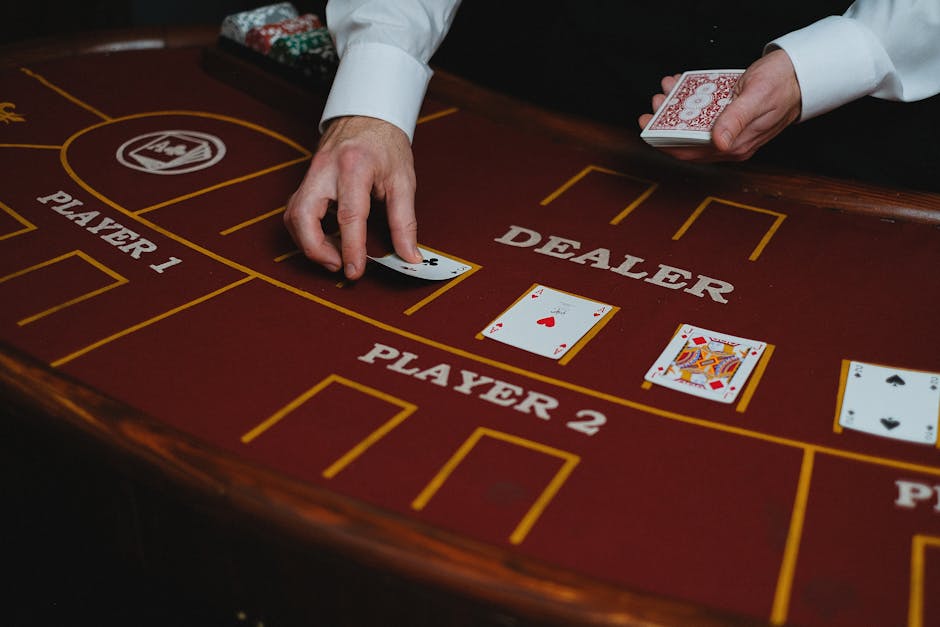
A Simple Rule for UI Animation Restraint
Animation helps when it makes an interface change easier to notice, interpret, or act on. It distracts when it competes with more important information, slows down a routine action, reduces legibility, or pressures a player around a meaningful decision.

Keep the effect purposeful, the focal point clear, and the resting screen understandable without motion. Test on a real phone, protect space for controls and rules, and make balances and costs plain. Pretty simple.. That is the heart of ui animation restraint: not making games still, but making every movement count. When motion has a clear purpose and stops when that purpose is fulfilled, it strengthens motion clarity and gives players better focus in games.